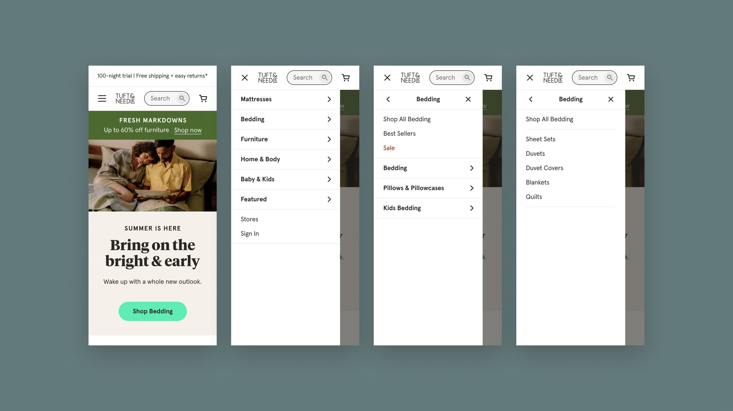
A refined navigation solution for our expanding product offering.
Tuft & Needle’s site navigation was experiencing growing pains as we grew from a company that sold one product to one that will sell upwards of 100 within the next few years.
Role
Lead UX Designer
How might we improve our navigation experience, and optimize it for conversion?
With our product offering growing so rapidly, our navigation needed to evolve too. Quickly leading customers to the products they’re looking for is our key to increasing conversion.
The goal of this project was to solve for our expanding product assortment, refine our overall navigation user experience (especially on mobile), and improve our conversion rate.
Preparation & Process
Workshop + Planning
After doing an initial round of research and discovery, I kicked off a navigation design sprint with a cross-functional team of physical product managers, copywriters, developers, marketers, and CX.
Rough Sketches & Wireframing
We came out of our workshop with a lot of great ideas. Next, I created some rough sketches before hopping into Figma to develop wires and a prototype for user testing.
User Testing
I collaborated with our User Researcher to develop hypotheses and a script for user testing our new vs our old navigation design.
The Existing Design
Our existing design was a concept that worked okay when we had around 20 products. Quite a few opportunities here for refining hierarchy, UI, and content.
New Prototype for User Testing
Our proposed design made with many usability improvements would set the stage for our growing product assortment in 2022.
Actionable user insights informed the second iteration of our design.
Finding products is easier on mobile with tertiary categories.
In our new prototype, users spent less time and interactions finding products.
We know that creating an easier pathway to our products is a big win for conversion, as customers who can find what they are looking for are less likely to leave our site in frustration.
Listing individual products is “too in the weeds”.
Users expressed that listing individual products in the navigation was a bit “too in the weeds” compared to higher-level product categories.
In the past, we’ve included all of our products in the navigation due to our small product lineup, but our offering is becoming too large to continue this approach.
Some users preferred the hamburger menu.
Users who prefer the hamburger menu did so because the icon is more familiar to them.
While there wasn’t a clear winner in user testing, we did perform a CRO A/B test afterward, and the hamburger menu was the winner by a long shot!
By switching to the hamburger menu, we increased daily revenue by $10K, and annually by $3.65M.
CRO testing allowed us to further validate our solutions.
Due to bandwidth limitations, we rolled out updates to the live design through a series of Conversion Rate Optimization (CRO) tests, allowing us to track our direct impact on Tuft & Needle’s conversion rate.
We performed two navigation CRO tests, contributing to over $5.4M annually.
T&N Rebrand
+ Final Design
Late 2021, Tuft & Needle rebranded, and we had another opportunity to further refine our navigation design. This time around we implemented any remaining learnings from user testing and added sitewide search.
Results
Our refined design improved our overall user experience by making it much easier for customers to find what they’re looking for.
From our incremental changes through CRO tests alone, our revenue increased by $14.8K/day, and $5.4M annually.
The newest iteration of our design has yet to go live, but we will be launching it within the coming months.
Special thanks to:
Gina Kovanda (UX Design), Brooke Kao (Research), Lauren Baer (Copywriting), Marilyn Cole (Product Management), and the rest of the Customer Acquisition Team (Development).


